Css Introduction

What is CSS?

CSS is the language we use to style a Web page.

  • CSS stands for Cascading Style Sheets
  • CSS describes how HTML elements are to be displayed on screen, paper, or in other media
  • CSS saves a lot of work. It can control the layout of multiple web pages all at once
  • External stylesheets are stored in CSS files

HTML vs CSS

Why Use CSS?

CSS is used to define styles for your web pages, including the design, layout and variations in display for different devices and screen sizes

The image below shows the same page with and without CSS.

Power of CSS


CSS Syntax

CSS Syntax

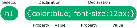
A CSS rule consists of a selector and a declaration block:

Eg:

CSS selector


The selector points to the HTML element you want to style.

The declaration block contains one or more declarations separated by semicolons.

Each declaration includes a CSS property name and a value, separated by a colon.

Multiple CSS declarations are separated with semicolons, and declaration blocks are surrounded by curly braces.

How To Add CSS

How to Add CSS

When a browser reads a style sheet, it will format the HTML document according to the information in the style sheet.

There are three ways of inserting a style sheet:

  1. External CSS - link to an external .css file
  2. Internal CSS - use the <style> element in the head section
  3. Inline CSS - use the style attribute on HTML elements


External CSS

External CSS

With an external style sheet, you can change the look of an entire website by changing just one file!

Each HTML page must include a reference to the external style sheet file inside the <link> element, inside the head section.

Example

External styles are defined within the <link> element, inside the <head> section of an HTML page:


<!DOCTYPE html>

<html>

<head>

<link rel="stylesheet" href="mystyle.css">

</head>

<body>


<h1>This is a heading</h1>

<p>This is a paragraph.</p>


</body>

</html>


An external style sheet can be written in any text editor, and must be saved with a .css extension.

The external .css file should not contain any HTML tags.

Here is how the "mystyle.css" file looks:

"mystyle.css"


body {

  background-color: lightblue;

}


h1 {

  color: navy;

  margin-left: 20px;

}

Internal CSS

An internal style sheet may be used if one single HTML page has a unique style.

The internal style is defined inside the <style> element, inside the head section.

Example

Internal styles are defined within the <style> element, inside the <head> section of an HTML page:


<!DOCTYPE html>

<html>

<head>

<style>

body {

 background-color: linen;

}


h1 {

 color: maroon;

 margin-left: 40px;

}

</style>

</head>

<body>


<h1>This is a heading</h1>

<p>This is a paragraph.</p>


</body>

</html>

Inline CSS

Inline CSS

An inline style may be used to apply a unique style for a single element.

To use inline styles, add the style attribute to the relevant element. The style attribute can contain any CSS property.

Example

Inline styles are defined within the "style" attribute of the relevant element:


<!DOCTYPE html>

<html>

<body>


<h1 style="color:blue;text-align:center;">This is a heading</h1>

<p style="color:red;">This is a paragraph.</p>


</body>

</html>

CSS Selectors

 What are CSS Selectors?

CSS selectors are used to target and select HTML elements so that styles (CSS rules) can be applied to them.

They act like a bridge between your HTML structure and your CSS styling.

πŸ‘‰ Example:

p {
  color: blue;
}

This selector targets all <p> elements and makes their text blue.


 Types of CSS Selectors

CSS selectors are mainly divided into 5 categories:


Simple Selectors

Simple Selectors

These selectors target elements based on basic identifiers like name, id, or class.

Types:

πŸ”Έ Element Selector

Selects elements by tag name.

h1 {
  color: red;
}

πŸ”Έ ID Selector

Selects a unique element with a specific id.

#header {
  background-color: black;
}

πŸ‘‰ Note: ID must be unique in a page.

πŸ”Έ Class Selector

Selects elements with a specific class.

.box {
  border: 1px solid gray;
}

πŸ‘‰ Multiple elements can share the same class.

πŸ”Έ Universal Selector

Selects all elements.

* {
  margin: 0;
  padding: 0;
}

πŸ”Έ Group Selector

Apply same style to multiple elements.

h1, p, div {
  color: green;
}


Combinator Selectors

Combinator Selectors

These selectors define relationships between elements.

πŸ”Έ Descendant Selector (space)

Selects all matching elements inside another element.

div p {
  color: blue;
}

πŸ‘‰ Targets all <p> inside <div>

πŸ”Έ Child Selector (>)

Selects direct children only.

div > p {
  color: red;
}

πŸ”Έ Adjacent Sibling (+)

Selects the next immediate sibling.

h1 + p {
  color: orange;
}

πŸ”Έ General Sibling (~)

Selects all siblings after an element.

h1 ~ p {
  color: purple;
}


Pseudo-class Selectors

 Pseudo-class Selectors

Used to define a special state of an element.

πŸ”Έ Common Examples:

a:hover {
  color: red;
}

πŸ‘‰ When user hovers over a link

input:focus {
  border: 2px solid blue;
}


li:first-child {
  color: green;
}


li:last-child {
  color: blue;
}


li:nth-child(2) {
  color: red;
}


Pseudo-elements Selectors

 Pseudo-elements Selectors

Used to style specific parts of elements.

πŸ”Έ Examples:

p::first-letter {
  font-size: 30px;
}


p::first-line {
  color: blue;
}


::selection {
  background: yellow;
}


p::before {
  content: "πŸ‘‰ ";
}


p::after {
  content: " βœ”";
}


Attribute Selectors

Attribute Selectors

Select elements based on attributes or attribute values.

πŸ”Έ Examples:

input[type="text"] {
  border: 1px solid gray;
}


a[target="_blank"] {
  color: red;
}


img[alt] {
  border: 2px solid black;
}


Modern CSS Pseudo Classes

1. :is()

Used to group multiple selectors cleanly.


Without :is()

section h1,
section h2,
section h3{
  color:red;
}

With :is()

section :is(h1,h2,h3){
  color:red;
}

Much cleaner.


2. :where()

Looks similar to :is()

BUT…

Specificity becomes:

ZERO (0)

Example

:where(h1,h2,h3){
  margin:0;
}


3. :not()

Select everything EXCEPT something.

Example

button:not(.primary){
  background:gray;
}

Meaning:

Select all buttons
EXCEPT .primary


CSS Colors

CSS Colors

In CSS, colors are specified by using a predefined color name, or with a RGB, HEX, HSL, RGBA, HSLA value.


CSS Background Color

You can set the background color for HTML elements:

Hello World


Lorem ipsum dolor sit amet, consectetuer adipiscing elit, sed diam nonummy nibh euismod tincidunt ut laoreet dolore magna aliquam erat volutpat. Ut wisi enim ad minim veniam, quis nostrud exerci tation ullamcorper suscipit lobortis nisl ut aliquip ex ea commodo consequat.


Example

<h1 style="background-color:DodgerBlue;">Hello World</h1>

<p style="background-color:Tomato;">Lorem ipsum...</p>


CSS Text Color

You can set the color of text:

Hello World

Lorem ipsum dolor sit amet, consectetuer adipiscing elit, sed diam nonummy nibh euismod tincidunt ut laoreet dolore magna aliquam erat volutpat.

Ut wisi enim ad minim veniam, quis nostrud exerci tation ullamcorper suscipit lobortis nisl ut aliquip ex ea commodo consequat.

Example

<h1 style="color:Tomato;">Hello World</h1>

<p style="color:DodgerBlue;">Lorem ipsum...</p>

<p style="color:MediumSeaGreen;">Ut wisi enim...</p>


CSS Border Color

You can set the color of borders:

<h1 style="border:2px solid Tomato;">Hello World</h1>


CSS RGB Colors

RGB Value

An RGB color value represents RED, GREEN, and BLUE light sources.

In CSS, a color can be specified as an RGB value, using this formula:

rgb(red, greenblue)

Each parameter (red, green, and blue) defines the intensity of the color between 0 and 255.

For example, rgb(255, 0, 0) is displayed as red, because red is set to its highest value (255) and the others are set to 0.

To display black, set all color parameters to 0, like this: rgb(0, 0, 0).

To display white, set all color parameters to 255, like this: rgb(255, 255, 255).

Experiment by mixing the RGB values below:

rgb(255, 99, 71)


ο»ΏRGBA Value

RGBA color values are an extension of RGB color values with an alpha channel - which specifies the opacity for a color.

An RGBA color value is specified with:

rgba(red, greenblue, alpha)

The alpha parameter is a number between 0.0 (fully transparent) and 1.0 (not transparent at all):

Experiment by mixing the RGBA values below:

rgba(255, 99, 71, 0.5)


HEX Value

A hexadecimal color is specified with: #RRGGBB.

In CSS, a color can be specified using a hexadecimal value in the form:

#rrggbb

Where rr (red), gg (green) and bb (blue) are hexadecimal values between 00 and ff (same as decimal 0-255).

For example, #ff0000 is displayed as red, because red is set to its highest value (ff) and the others are set to the lowest value (00).

To display black, set all values to 00, like this: #000000.

To display white, set all values to ff, like this: #ffffff. 

Experiment by mixing the HEX values below:


#ff6347

3 Digit HEX Value

Sometimes you will see a 3-digit hex code in the CSS source.

The 3-digit hex code is a shorthand for some 6-digit hex codes.

The 3-digit hex code has the following form:

#rgb

Where r, g, and b represent the red, green, and blue components with values between 0 and f.

The 3-digit hex code can only be used when both the values (RR, GG, and BB) are the same for each component. So, if we have #ff00cc, it can be written like this: #f0c.

Here is an example:

Example

body {

 background-color: #fc9; /* same as #ffcc99 */

}


h1 {

 color: #f0f; /* same as #ff00ff */

}


{

 color: #b58; /* same as #bb5588 */

}

HSL

HSL Value

HSL stands for hue, saturation, and lightness.

In CSS, a color can be specified using hue, saturation, and lightness (HSL) in the form:

hsl(huesaturationlightness)

Hue is a degree on the color wheel (from 0 to 360):

  • 0 (or 360) is red
  • 120 is green
  • 240 is blue

Saturation is a percentage value: 0% means a shade of gray, and 100% is the full color.

Lightness is also a percentage; 0% is black, 50% is neither light or dark, 100% is white.

Experiment by mixing the HSL values below:


hsl(0, 100%, 50%)


Saturation

Saturation can be described as the intensity of a color.

100% is pure color, no shades of gray.

50% is 50% gray, but you can still see the color.

0% is completely gray; you can no longer see the color.


Lightness

The lightness of a color can be described as how much light you want to give the color, where 0% means no light (black), 50% means 50% light (neither dark nor light) and 100% means full lightness (white).


HSLA Value

HSLA color values are an extension of HSL color values with an alpha channel - which specifies the opacity for a color.

An HSLA color value is specified with:

hsla(hue, saturationlightness, alpha)

The alpha parameter is a number between 0.0 (fully transparent) and 1.0 (not transparent at all):

Experiment by mixing the HSLA values below:

hsla(0, 100%, 50%, 0.5)


CSS UNITS

CSS units define size, spacing, and layout.

πŸ‘‰ Used in:

  • width / height
  • margin / padding
  • font-size
  • positioning

Example:

div {
  width: 200px;
}

Here, px is the unit.

TYPES OF CSS UNITS

There are 2 main categories:

1. Absolute Units

Fixed size (does NOT change)

2. Relative Units

Changes based on screen / parent / root

ABSOLUTE UNITS (FIXED)

 px (Pixels) β€” MOST COMMON

.box {
  width: 200px;
}

1px = 1 screen pixel

Use when:

  • Borders
  • Small fixed elements
  • Icons

Problem:

Not responsive


Other Absolute Units (Rare)


RELATIVE UNITS

% (Percentage)

.container {
  width: 50%;
}

πŸ‘‰ Relative to parent element

Example:

.parent {
  width: 400px;
}

.child {
  width: 50%; /* = 200px */
}


em (Relative to Parent Font Size)

.parent {
  font-size: 20px;
}

.child {
  font-size: 2em; /* = 40px */
}

πŸ‘‰ 1em = parent font-size


⚠️ Problem with em (IMPORTANT)

It can stack and grow unexpectedly

.parent {
  font-size: 20px;
}

.child {
  font-size: 2em; /* 40px */
}

.grandchild {
  font-size: 2em; /* 80px 😡 */
}


 rem (ROOT EM) β€” BEST PRACTICE βœ…

html {
  font-size: 16px;
}

h1 {
  font-size: 2rem; /* = 32px */
}

πŸ‘‰ Always based on <html>

βœ”οΈ Why use rem?

  • Consistent
  • Predictable
  • Responsive friendly


vw (Viewport Width)

div {
  width: 50vw;
}

πŸ‘‰ 50% of screen width


vh (Viewport Height)

div {
  height: 100vh;
}

πŸ‘‰ Full screen height


πŸ”₯ Real Example:

.hero {
  height: 100vh;
}

πŸ‘‰ Full screen hero section


vmin & vmax

div {
  width: 50vmin;
}

πŸ‘‰ Based on smaller/larger screen dimension


KEY DIFFERENCES


MODERN CSS UNITS

clamp() β€” RESPONSIVE WITH LIMITS


SYNTAX

clamp(MIN, PREFERRED, MAX)

πŸ‘‰ Think like this:

β€œValue should grow… but NOT go below MIN and NOT exceed MAX”


YOUR EXAMPLE

font-size: clamp(16px, 2vw, 32px);


calc() β€” DYNAMIC CALCULATION

SYNTAX

calc(expression)

You can do math inside CSS:

  • +
  • -
  • *
  • /


BASIC EXAMPLE

width: calc(100% - 50px);


πŸ” HOW IT CALCULATES

Let’s say:

  • Parent width = 1000px

πŸ‘‰ 100% = 1000px

Now:

1000px - 50px = 950px

πŸ‘‰ Final width = 950px


 Example 1: Layout spacing

.container {
  width: calc(100% - 40px);
}

πŸ‘‰ Leaves space for padding/margin


Example 2: Centering trick

.box {
  left: calc(50% - 100px);
}

πŸ‘‰ Moves element to center


Example 3: Equal columns

.col {
  width: calc(100% / 3);
}

πŸ‘‰ 3 equal columns

CSS Text

CSS Text Color

CSS Text Color

The color property is used to set the color of the text. The color is specified by:

  • a color name - like "red"
  • a HEX value - like "#ff0000"
  • an RGB value - like "rgb(255,0,0)"


Text Color and Background Color

In this example, we define both the background-color property and the color property:

Example

body {

 background-color: lightgrey;

 color: blue;

}


h1 {

 background-color: black;

 color: white;

}


CSS Text Alignment

CSS Text Alignment and Text Direction


Text Alignment

The text-align property is used to set the horizontal alignment of a text.

This property can have one of the following values:

  • left - Aligns the text to the left
  • right - Aligns the text to the right
  • center - Centers the text
  • justify - Stretches the lines so that each line has equal width


When the text-align property is set to "justify", each line is stretched so that every line has equal width, and the left and right margins are straight (like in magazines and newspapers):

Example

div {

  text-align: justify;

}


Text Align Last

The text-align-last property specifies how to align the last line of a text.

This property can have one of the following values:

  • auto - Default value. The last line is justified and aligned left
  • left - The last line is aligned to the left
  • right - The last line is aligned to the right
  • center - The last line is center-aligned
  • justify - The last line is justified as the rest of the lines
  • start - The last line is aligned at the start of the line
  • end - The last line is aligned at the end of the line


Example

Different alignment of the last line in three <p> elements:

p.a {

 text-align-last: right;

}


p.b {

 text-align-last: center;

}


p.c {

  text-align-last: justify;

}


Vertical Alignment

The vertical-align property sets the vertical alignment of an element.

This property can have one of the following values:

  • baseline - Default value. The element is aligned with the baseline of the parent
  • length/% - Raises or lower an element by the specified length or percent
  • sub - The element is aligned with the subscript baseline of the parent
  • super - The element is aligned with the superscript baseline of the parent
  • top - The element is aligned with the top of the tallest element on the line
  • text-top - The element is aligned with the top of the parent element's font
  • middle - The element is placed in the middle of the parent element
  • bottom - The element is aligned with the lowest element on the line
  • text-bottom - The element is aligned with the bottom of the parent element's font


CSS Text Decoration

CSS Text Decoration

The CSS text-decoration property is used to control the appearance of decorative lines on text.

It is a shorthand property for the following individual properties:

Add a Decoration Line to Text

The CSS text-decoration-line property sets the type of decoration line added to the text.

This property can have one or more of the following values:

  • none - Default value. Displays no decoration line
  • underline - The decoration line is displayed under the text
  • overline - The decoration line is displayed over the text
  • line-through - The decoration line is displayed through the text

Tip: You can combine multiple values, like overline and underline to display lines both over and under a text.


Example


h1 {

 text-decoration-line: overline;

}


h2 {

 text-decoration-line: line-through;

}


h3 {

 text-decoration-line: underline;

}


{

 text-decoration-line: overline underline;

}

Specify a Color for the Decoration Line

The CSS text-decoration-color property is used to set the color of the decoration line.

Example

Add different colors to the decoration line:

h1 {

 text-decoration-line: overline;

 text-decoration-color: red;

}


The text-decoration-style property sets the style of the text decoration (like solid, wavy, dotted, dashed, double).

Tip: Also look at the text-decoration property, which is a short-hand property for text-decoration-line, text-decoration-style, text-decoration-color, and text-decoration-thickness. 


The text-decoration-thickness property specifies the thickness of the decoration line.

CSS Text Transformation

CSS Text Transformation

The CSS text-transform property is used to control the capitalization of text in an element.

It can be used to transform a text into uppercase or lowercase letters, or capitalize the first letter of each word, without changing the original content in HTML.

This property can have one of the following values:

  • none - No transformation. Text renders as it is
  • capitalize - Transforms the first character of each word to uppercase
  • uppercase - Transforms all characters to uppercase
  • lowercase - Transforms all characters to lowercase


CSS Text Spacing

CSS Text Spacing

CSS has several properties to control text spacing.

In this chapter you will learn about the following properties:


CSS Text Indentation

The CSS text-indent property is used to specify the indentation of the first line in a text-block.

Tip: Negative values are allowed. The first line will be indented to the left if the value is negative.

Example

Indent the first line of text in a text-block:

{

 text-indent: 50px;

}

CSS Letter Spacing

The CSS letter-spacing property is used to specify the space between the characters in a text.

Tip: Negative values are allowed.

Example

Increase and decrease the space between characters:

h1 {

 letter-spacing: 5px;

}


h2 {

  letter-spacing: -2px;

}


CSS Line Height

The CSS line-height property is used to specify the space between lines.

Note: Negative values are not allowed.

Example

Specify the space between lines:

p.small {

 line-height: 0.8;

}


p.big {

 line-height: 1.8;

}


CSS Word Spacing

The CSS word-spacing property is used to specify the space between the words in a text.

Tip: Negative values are allowed.

Example

Increase and decrease the space between words:

p.one {

  word-spacing: 10px;

}


p.two {

  word-spacing: -2px;

}


CSS White Space

The CSS white-space property specifies how white-space inside an element is handled.

This property can have one of the following values:

  • normal
  • nowrap
  • pre

Example

How to disable text wrapping inside an element

{

 white-space: nowrap;

}


CSS Text Shadow

CSS Text Shadow

The text-shadow property adds shadow to text.

In its simplest use, you only specify the horizontal and the vertical shadow.

In addition, you can add a shadow color and blur effect.


Horizontal and vertical shadow:

h1 {

  text-shadow: 2px 2px;

}


Horizontal and vertical shadow, with color:

h1 {

  text-shadow: 2px 2px red;

}


ο»ΏHorizontal and vertical shadow, with color and blur effect:

h1 {

  text-shadow: 2px 2px 5px red;

}


ο»ΏMultiple Shadows

The text-shadow property also accepts multiple shadows for an element. Define each shadow in a comma-separated list.

The following example shows a red and blue neon glow shadow:

Text shadow effect!

Example

Text-shadow with red and blue neon glow:

h1 {

 text-shadow: 0 0 3px #ff0000, 0 0 5px #0000ff;

}

CSS Backgrounds

CSS Backgrounds

The CSS background properties are used to add background effects for elements.

In these chapters, you will learn about the following CSS background properties:

  • background-color
  • background-image
  • background-repeat
  • background-attachment
  • background-position
  • background (shorthand property)


CSS background-color

The background-color property specifies the background color of an element.

Example

The background color of a page is set like this:


body {

  background-color: lightblue;

}


With CSS, a color is most often specified by:

  • a valid color name - like "red"
  • a HEX value - like "#ff0000"
  • an RGB value - like "rgb(255,0,0)"

Look at CSS Color Values for a complete list of possible color values.


Other Elements


You can set the background color for any HTML elements:

Example

Here, the <h1>, <p>, and <div> elements will have different background colors: 

h1 {

  background-color: green;

}


div {

  background-color: lightblue;

}


{

  background-color: yellow;

}


Opacity / Transparency

The opacity property specifies the opacity/transparency of an element. It can take a value from 0.0 - 1.0. The lower value, the more transparent:


Example

div {

 background-color: green;

  opacity: 0.3;

}


Note: When using the opacity property to add transparency to the background of an element, all of its child elements inherit the same transparency. This can make the text inside a fully transparent element hard to read.


Transparency using RGBA

If you do not want to apply opacity to child elements, like in our example above, use RGBA color values. The following example sets the opacity for the background color and not the text:


Example

div {

 background: rgba(0, 128, 0, 0.3) /* Green background with 30% opacity */

}

CSS Background Image

CSS background-image

The background-image property specifies an image to use as the background of an element.

By default, the image is repeated so it covers the entire element.

Example

Set the background image for a page: 

body {

  background-image: url("paper.gif");

}


ο»ΏThe background image can also be set for specific elements, like the <p> element:

Example

{

  background-image: url("paper.gif");

}

CSS Background Image Repeat

CSS background-repeat

The background-repeat property sets if/how a background image will be repeated.

By default, a background-image is repeated both vertically and horizontally.

Some images should be repeated only horizontally or vertically, or they will look strange


CSS background-repeat Horizontally

If the image above is repeated only horizontally (background-repeat: repeat-x;), the background will look better:

Example

body {

  background-image: url("gradient_bg.png");

  background-repeat: repeat-x;


Tip: To repeat an image only vertically, use background-repeat: repeat-y;


CSS background-repeat: no-repeat

Showing the background image only once is also specified by the background-repeat property:

Example

Show the background image only once:

body {

  background-image: url("img_tree.png");

  background-repeat: no-repeat;

}


CSS background-position

The background-position property is used to set the starting position of the background image.

By default, a background-image is placed at the top-left corner of an element.

Example

Position the background image in the top-right corner: 

body {

 background-image: url("img_tree.png");

 background-repeat: no-repeat;

 background-position: right top;

}


ο»Ώ

CSS BACKGROUND-SIZE

The background-size property specifies the size of the background image in an element.

It controls how the image is scaled, stretched, or fitted inside the container.


Purpose

  • Adjust background image dimensions
  • Control responsiveness of images
  • Prevent distortion or overflow
  • Create full-width or contained layouts


CSS Background Attachment

The background-attachment property specifies whether the background image should scroll or be fixed (will not scroll with the rest of the page):

Example

Specify that the background image should be fixed:

body {

  background-image: url("img_tree.png");

  background-repeat: no-repeat;

  background-position: right top;

 background-attachment: fixed;

}


Example

Specify that the background image should scroll with the rest of the page:

body {

 background-attachment: scroll;

}


CSS initial Keyword


Example

Set the text color of the <div> element to red, but keep the initial color for <h1> elements:

div {

  color: red;

}


h1 {

  color: initial;

}

Definition and Usage

The initial keyword is used to set a CSS property to its default value.

The initial keyword can be used for any CSS property, and on any HTML element.


CSS inherit Keyword


Example

Set the text-color for <span> elements to blue, except those inside elements with class="extra":

span {

 color: blue;

}


.extra span {

  color: inherit;

}

Definition and Usage

The inherit keyword specifies that a property should inherit its value from its parent element.

The inherit keyword can be used for any CSS property, and on any HTML element.

CSS Background Shorthand

CSS background - Shorthand property

To shorten the code, it is possible to specify all the background properties in one single property. This is called a shorthand property.

Instead of writing:


body {

 background-color: #ffffff;

 background-image: url("img_tree.png");

 background-repeat: no-repeat;

 background-position: right top;

}


You can use the shorthand property background:


Example

Use the shorthand property to set all the background properties in one declaration:

body {

 background: #ffffff url("img_tree.png") no-repeat right top;

}


The background property is a shorthand property for the following properties:

  • background-color
  • background-image
  • background-position
  • background-size
  • background-repeat
  • background-attachment
  • background-origin
  • background-clip

If some of the property values are missing, they will be set to their initial (default) values.


Backdrop-filter

backdrop-filter

Blurs the background behind the element.

backdrop-filter: blur(10px);

Element stays clear.

Background becomes blurry.


Glass CardHTML Sandbox β€” click to edit


Important Understanding

filter

Affects the element itself.

filter: blur(10px);

Entire element becomes blurry.

CSS Borders

CSS Borders

The CSS border properties allow you to specify the style, width, and color of an element's border.


CSS Border Style

The border-style property specifies what kind of border to display.

The following values are allowed:

  • dotted - Defines a dotted border
  • dashed - Defines a dashed border
  • solid - Defines a solid border
  • double - Defines a double border
  • groove - Defines a 3D grooved border. The effect depends on the border-color value
  • ridge - Defines a 3D ridged border. The effect depends on the border-color value
  • inset - Defines a 3D inset border. The effect depends on the border-color value
  • outset - Defines a 3D outset border. The effect depends on the border-color value
  • none - Defines no border
  • hidden - Defines a hidden border

The border-style property can have from one to four values (for the top border, right border, bottom border, and the left border).


CSS Border Width

CSS Border Width

The border-width property specifies the width of the four borders.

The width can be set as a specific size (in px, pt, cm, em, etc) or by using one of the three pre-defined values: thin, medium, or thick:

Example

Demonstration of the different border widths:

p.one {

 border-style: solid;

 border-width: 5px;

}


p.two {

 border-style: solid;

  border-width: medium;

}


p.three {

 border-style: dotted;

  border-width: 2px;

}


p.four {

 border-style: dotted;

  border-width: thick;

}

Specific Side Widths

The border-width property can have from one to four values (for the top border, right border, bottom border, and the left border):

Example

p.one {

 border-style: solid;

 border-width: 5px 20px; /* 5px top and bottom, 20px on the sides */

}


p.two {

 border-style: solid;

 border-width: 20px 5px; /* 20px top and bottom, 5px on the sides */

}


p.three {

 border-style: solid;

 border-width: 25px 10px 4px 35px; /* 25px top, 10px right, 4px bottom and 35px left */

}


CSS Border Color

CSS Border Color

The border-color property is used to set the color of the four borders.

The color can be set by:

  • name - specify a color name, like "red"
  • HEX - specify a HEX value, like "#ff0000"
  • RGB - specify a RGB value, like "rgb(255,0,0)"
  • HSL - specify a HSL value, like "hsl(0, 100%, 50%)"
  • transparent

Note: If border-color is not set, it inherits the color of the element.

Example

Demonstration of the different border colors:

p.one {

 border-style: solid;

 border-color: red;

}


p.two {

 border-style: solid;

  border-color: green;

}


p.three {

  border-style: dotted;

  border-color: blue;

}


Specific Side Colors

The border-color property can have from one to four values (for the top border, right border, bottom border, and the left border). 

Example

p.one {

  border-style: solid;

  border-color: red green blue yellow; /* red top, green right, blue bottom and yellow left */

}


HEX Values

The color of the border can also be specified using a hexadecimal value (HEX):

Example

p.one {

  border-style: solid;

  border-color: #ff0000; /* red */

}


RGB Values

Or by using RGB values:

Example

p.one {

 border-style: solid;

 border-color: rgb(255, 0, 0); /* red */

}


HSL Values

You can also use HSL values:

Example

p.one {

 border-style: solid;

 border-color: hsl(0, 100%, 50%); /* red */

}

CSS Border Sides

CSS Border - Individual Sides

From the examples on the previous pages, you have seen that it is possible to specify a different border for each side.

In CSS, there are also properties for specifying each of the borders (top, right, bottom, and left):

In the example below we use the four properties above to set the style of each border side:

Example

{

 border-top-style: dotted;

 border-right-style: solid;

  border-bottom-style: dotted;

  border-left-style: solid;

}


ο»ΏWe can also use the shorthand border-style property to achieve the same result.

The example below gives the same result as the example above:

Example

{

 border-style: dotted solid;

}

CSS Shorthand Border Property

CSS Border - Shorthand Property

Like you saw in the previous page, there are many properties to consider when dealing with borders.

To shorten the code, it is also possible to specify all the individual border properties in one property.

The border property is a shorthand property for the following individual border properties:

Example

{

 border: 5px solid red;

}


You can also specify all the individual border properties for just one side:

Left Border

{

 border-left: 6px solid red;

}


CSS Rounded Borders

CSS Rounded Borders

The border-radius property is used to add rounded borders to an element:

Example

{

  border: 2px solid red;

  border-radius: 5px;

}


Definition and Usage

The border-radius property defines the radius of the element's corners.


Tip: This property allows you to add rounded corners to elements! 


This property can have from one to four values. Here are the rules:


Four values - border-radius: 15px 50px 30px 5px; (first value applies to top-left corner, second value applies to top-right corner, third

value applies to bottom-right corner, and fourth value applies to bottom-left corner)


Three values - border-radius: 15px 50px 30px; (first value applies to top-left corner, second value applies to top-right and bottom-left corners, and third value applies to bottom-right corner)


Two values - border-radius: 15px 50px; (first value applies to top-left and bottom-right corners, and the second value applies to top-right and bottom-left corners)


One value - border-radius: 15px; (the value applies to all four corners, which are rounded equally

CSS Margins

CSS Margins

The CSS margin properties are used to create space around elements, outside of any defined borders.


Margins define the distance between an element's border and the surrounding elements.


With CSS, you have full control over the margins. CSS has properties for setting the margin for each individual side of an element (top, right, bottom, and left), and a shorthand property for setting all the margin properties in one declaration.


Margin - Individual Sides

CSS has properties for specifying the margin for each side of an element:

All the margin properties can have the following values:

  • auto - the browser calculates the margin
  • length - specifies a margin in px, pt, cm, etc.
  • % - specifies a margin in % of the width of the containing element
  • inherit - specifies that the margin should be inherited from the parent element

Tip: Negative values are also allowed.


Margin - Shorthand Property

To shorten the code, it is possible to specify all the margin properties in one declaration.

The margin property is a shorthand property for the following individual margin properties:

Here is how it works:

If the margin property has four values:

  • margin: 25px 50px 75px 100px;
  • top margin is 25px
  • right margin is 50px
  • bottom margin is 75px
  • left margin is 100px

Example

Use the margin shorthand property with four values:

{

  margin: 25px 50px 75px 100px;

}


If the margin property has three values:

  • margin: 25px 50px 75px;
  • top margin is 25px
  • right and left margins are 50px
  • bottom margin is 75px

Example

Use the margin shorthand property with three values: 

{

 margin: 25px 50px 75px;

}

If the margin property has two values:

  • margin: 25px 50px;
  • top and bottom margins are 25px
  • right and left margins are 50px

Example

Use the margin shorthand property with two values: 

{

 margin: 25px 50px;

}


If the margin property has one value:

  • margin: 25px;
  • all four margins are 25px


Example

Use the margin shorthand property with one value: 

{

  margin: 25px;

}


ο»ΏThe auto Value

You can set the margin property to auto to horizontally center the element within its container.

The element will then take up the specified width, and the remaining space will be split equally between the left and right margins.

Example

Use margin: auto:

div {

 width: 300px;

 margin: auto;

  border: 1px solid red;

}


CSS Margin Collapse

Margin collapse is when two margins collapse into a single margin.


Top and bottom margins of elements are sometimes collapsed into a single margin that is equal to the largest of the two margins.


Note: Margin collapse only happens with top and bottom margins! Not left and right margins!

CSS Padding

CSS Padding

The CSS padding properties are used to generate space around an element's content, inside of any defined borders.


With CSS, you have full control over the padding. There are properties for setting the padding for each side of an element (top, right, bottom, and left), and a shorthand property for setting all the padding properties in one declaration.


Padding - Individual Sides

CSS has properties for specifying the padding for each side of an element:

All the padding properties can have the following values:

  • length - specifies a padding in px, pt, cm, etc.
  • % - specifies a padding in % of the width of the containing element
  • inherit - specifies that the padding should be inherited from the parent element

Note: Negative values are not allowed.


Example

Set different padding for all four sides of a <div> element:  

div {

 padding-top: 50px;

  padding-right: 30px;

  padding-bottom: 50px;

  padding-left: 80px;

}


Padding - Shorthand Property

To shorten the code, it is possible to specify all the padding properties in one declaration.

The padding property is a shorthand property for the following individual padding properties:

Here is how it works:

If the padding property has four values:

  • padding: 25px 50px 75px 100px;
  • top padding is 25px
  • right padding is 50px
  • bottom padding is 75px
  • left padding is 100px

Example

Use the padding shorthand property with four values:

div {

 padding: 25px 50px 75px 100px;

}

If the padding property has three values:

  • padding: 25px 50px 75px;
  • top padding is 25px
  • right and left paddings are 50px
  • bottom padding is 75px

Example

Use the padding shorthand property with three values: 

div {

 padding: 25px 50px 75px;

}

If the padding property has two values:

  • padding: 25px 50px;
  • top and bottom paddings are 25px
  • right and left paddings are 50px

Example

Use the padding shorthand property with two values: 

div {

 padding: 25px 50px;

}


If the padding property has one value:

  • padding: 25px;
  • all four paddings are 25px


Example

Use the padding shorthand property with one value: 

div {

 padding: 25px;

}


Padding and box-sizing

Padding and Element Width

The CSS width property specifies the width of the element's content area. The content area is the portion inside the padding, border, and margin of an element (the box model).

So, if an element has a specified width, the padding added to that element will be added to the total width of the element. This is often an undesirable result.

Example

Here, the <div> element is given a width of 300px. However, the actual width of the <div> element will be 350px (300px + 25px of left padding + 25px of right padding):

div {

  width: 300px;

  padding: 25px;

}

Padding and box-sizing

The box-sizing property defines how the width and height of an element are calculated: should they include padding and borders, or not.

The box-sizing property can have the following values:

  • content-box - This is default. The width and height properties includes only the content (border and padding are not included)
  • border-box - The width and height properties includes content, padding and border

So, to keep the width at 300px, no matter the amount of padding, you can use the box-sizing: border-box;. This causes the element to maintain its actual width; if you increase the padding, the available content space will decrease.

Example

Use the box-sizing property to keep the width at 300px, no matter the amount of padding:

div {

 width: 300px;

  padding: 25px;

  box-sizing: border-box;

}


CSS Height and Width

height and width

The height and width properties are used to set the height and width of an element.

The height and width do not include padding, borders, or margins. It sets the height and width of the area inside the padding, border, and margin of the element.


The height property sets the height of an element.

The height of an element does not include padding, borders, or margins!

If height: auto; the element will automatically adjust its height to allow its content to be displayed correctly.

If height is set to a numeric value (like pixels, (r)em, percentages) then if the content does not fit within the specified height, it will overflow. How the container will handle the overflowing content is defined by the overflow property.

Note: The min-height and max-height properties override the height property.


The width property sets the width of an element.

The width of an element does not include padding, borders, or margins!

Note: The min-width and max-width properties override the width property.


height and width Values

  • auto - This is default. The browser calculates the height and width
  • length - Defines the height or width in px, cm, em, etc.
  • % - Defines the height or width in percent of the containing block
  • initial - Sets the height or width to its default value
  • inherit - The height or width will be inherited from its parent value


min-height / max-height

CSS Using max-width

The max-width property sets the maximum allowed width of an element. This prevents the width of an element to be larger than the max-width property value.

The max-width property can have the following values:

  • length - Defines the maximum width in px, cm, etc.
  • % - Defines the maximum width in percent of the containing block
  • none - This is default. Means that there is no maximum width

One problem with the width property can occur when the browser window is smaller than the width of the element. The browser then adds a horizontal scrollbar to the page. So, using max-width will improve the browser's handling on small windows.


One <div> element with a max-width of 500 pixels, and one <div> element with a width of 500 pixels:

.div1 {

 max-width: 500px;

 background-color: powderblue;

}


.div2 {

 width: 500px;

 background-color: powderblue;

}


Note: If you use both the width property and the max-width property on the same element, and the value of the width property is larger than the max-width property; the max-width property value will be used!


The min-width property defines the minimum width of an element.

If the content is smaller than the minimum width, the minimum width will be applied.

If the content is larger than the minimum width, the min-width property has no effect.

Note: This prevents the value of the width property from becoming smaller than min-width.


Definition and Usage

The max-height property defines the maximum height of an element.

If the content is larger than the maximum height, it will overflow. How the container will handle the overflowing content is defined by the overflow property.

If the content is smaller than the maximum height, the max-height property has no effect.

Note: This prevents the value of the height property from becoming larger than max-height. The value of the max-height property overrides the height property.


The min-height property defines the minimum height of an element.

If the content is smaller than the minimum height, the minimum height will be applied.

If the content is larger than the minimum height, the min-height property has no effect.

Note: This prevents the value of the height property from becoming smaller than min-height.

aspect-ratio

Modern CSS property used to maintain proportional width & height automatically.


Basic Syntax

aspect-ratio: 16 / 9;

Meaning:

Width : Height
16    : 9

CSS LAYOUT BASICS

POSITION PROPERTY

πŸ‘‰ Controls how an element is placed on the page

Types of Position

1. position: static (DEFAULT)


Behavior:

  • Default for all elements
  • Follows normal document flow
  • top, left, etc DO NOT WORK
.box {
  position: static;
}

πŸ‘‰ You rarely use this manually


2. position: relative


Behavior:

  • Moves relative to its original position
  • Still occupies original space
.box {
  position: relative;
  top: 20px;
  left: 30px;
}

πŸ‘‰ Moves down 20px, right 30px


IMPORTANT:

  • Leaves a gap where it originally was


3. position: absolute


Behavior:

  • Removed from normal flow
  • Positioned relative to nearest positioned parent
.parent {
  position: relative;
}

.child {
  position: absolute;
  top: 0;
  right: 0;
}

πŸ‘‰ Child sticks to top-right of parent


⚠️ KEY RULE:

πŸ‘‰ If no parent has position β†’ uses body


ο»Ώ4. POSITION FIXED

The element stays fixed on the screen even while scrolling.


Used for:

  • navbar
  • floating buttons
  • chat icons
  • CTA buttons


5. POSITION STICKY

Element behaves:

  • normal initially
  • sticks after scroll reaches a point

Best for:

  • sticky navbar
  • section titles
  • sidebars


CSS DISPLAY PROPERTY

display?

πŸ‘‰ It defines how an element behaves in layout

  • Does it take full width?
  • Can it sit next to others?
  • Can you set width/height?


BASIC IDEA

Every HTML element is a box, and display decides:

πŸ‘‰ How that box is placed on the page

DISPLAY TYPES

display: block

Behavior

  • Takes full width
  • Starts on a new line
  • Can set width & height

Example:

<div>Box 1</div>
<div>Box 2</div>


div {
  display: block;
  background: lightblue;
}

πŸ‘‰ Output:

[Box 1       ]
[Box 2       ]


Common Block Elements:

  • <div>
  • <p>
  • <h1> to <h6>


display: inline

Behavior

  • Takes only content width
  • Stays in same line
  • ❌ Cannot set width/height

Example:

<span>One</span>
<span>Two</span>


span {
  display: inline;
  background: yellow;
}

πŸ‘‰ Output:

One Two


Common Inline Elements:

  • <span>
  • <a>
  • <strong>


display: inline-block

βœ… Behavior

  • Stays in same line
  • βœ… Can set width/height

Example:

<button>Btn 1</button>
<button>Btn 2</button>


button {
  display: inline-block;
  width: 100px;
  height: 50px;
}

πŸ‘‰ Output:

[Btn1] [Btn2]

πŸ“Œ Use Case:

  • Buttons
  • Cards in row 


. display: none

Behavior

  • Completely removes element
  • No space taken

Example:

div {
  display: none;
}

πŸ‘‰ Element disappears fully


Z-index

Z-Index

z-index controls the stack order of elements.

  • Higher z-index = element appears on top
  • Lower z-index = element stays behind

Think like layers in Photoshop.

HTML/CSS/JS SandboxHTML Sandbox β€” click to edit

Important Rule

z-index only works when element has:

position: relative;
position: absolute;
position: fixed;
position: sticky;

Without position, z-index usually won't work.


Negative Z-Index

.bg{
  position:absolute;
  z-index:-1;
}

Used to send elements behind everything.


Stacking Context 

Sometimes z-index not working because of stacking context.

BOX 1 PARENT CHILDHTML Sandbox β€” click to edit


Overflow

Overflow

overflow controls what happens when content becomes bigger than its container.


Basic Syntax

overflow: value;

Values:

  • visible
  • hidden
  • scroll
  • auto


1. overflow: hidden

Hides extra content outside the box.

Lorem ipsum dolor sit amet consectetur adipisicing elit. LHTML Sandbox β€” click to edit

2. overflow: scroll

Always shows scrollbar.

Lorem ipsum dolor sit amet consectetur adipisicing elit. LHTML Sandbox β€” click to edit

3. overflow: auto

Scrollbar appears ONLY when needed.


4. overflow-x and overflow-y

Control horizontal and vertical overflow separately.


Text Overflow

Used when text is too long.

text-overflow: ellipsis

Shows:

Hello this is very lo...

instead of breaking layout.


Required Properties

white-space: nowrap;
overflow: hidden;
text-overflow: ellipsis;

ALL 3 are needed.


This is a very long title that should not break the layoutHTML Sandbox β€” click to edit


Flex box

CSS FLEXBOX (Flexible Box Layout)

What is Flexbox?

Flexbox is a one-dimensional layout system used to arrange items in:

  • a row (horizontal) OR
  • a column (vertical)

Best for:

  • Navbar
  • Centering content
  • Small UI layouts
  • Aligning items


When you use:

.container {
  display: flex;
}


Two things are created:

  • Flex Container (parent)
  • Flex Items (children)


Flexbox vs. Grid

CSS Flexbox is used for a one-dimensional layout, with rows OR columns.

CSS Grid is used for a two-dimensional layout, with rows AND columns.


 Axes System


This is the most important concept in Flexbox.

  • Main Axis β†’ defined by flex-direction
  • Cross Axis β†’ perpendicular to main axis


Flex Container Properties

display:flex;

Activates flexbox.

.container {
  display: flex;
}

flex-direction: ;

Controls direction of items.

flex-direction: row;          /* default */
flex-direction: column;
flex-direction: row-reverse;
flex-direction: column-reverse;

πŸ‘‰ Changes the main axis


justify-content (Main Axis Alignment)

Controls how items are placed along main axis.


justify-content: flex-start;
justify-content: center;
justify-content: flex-end;
justify-content: space-between;
justify-content: space-around;
justify-content: space-evenly;


align-items (Cross Axis Alignment)

align-items: stretch;   /* default */
align-items: center;
align-items: flex-start;
align-items: flex-end;
align-items: baseline;

Box 1 Box 2 Box 3HTML Sandbox β€” click to edit

flex-wrap

πŸ‘‰ Controls wrapping

Example 1: No Wrap (Default)

.container {
  display: flex;
  flex-wrap: nowrap;
}

Example 2: Wrap

.container {
  flex-wrap: wrap;
}

πŸ‘‰ Items go to next line

Example 3: Wrap Reverse

.container {
  flex-wrap: wrap-reverse;
}
1 2 3 4 1 2 3 4 1 2 3 4HTML Sandbox β€” click to edit

gap

Example

.container {
  display: flex;
  gap: 20px;
}

πŸ‘‰ Adds spacing without margin


align-content

align-content is used to control the spacing between rows (or columns) of flex items when they wrap onto multiple lines.

πŸ‘‰ Important:

It only works when flex-wrap:wrap; is enabled AND there are multiple lines.


πŸ”₯ Key Idea

  • align-items β†’ aligns items inside a single row
  • align-content β†’ aligns multiple rows as a group

 Values of align-content

1. flex-start

Lines are packed at the top

.container {
  align-content: flex-start;
}

2. flex-end

Lines are packed at the bottom

.container {
  align-content: flex-end;
}

3. center

Lines are centered vertically

.container {
  align-content: center;
}

4. space-between

Equal space between rows

.container {
  align-content: space-between;
}

5. space-around

Equal space around rows

.container {
  align-content: space-around;
}

6. space-evenly

Equal spacing everywhere

.container {
  align-content: space-evenly;
}

7. stretch (default)

Rows stretch to fill container

.container {
  align-content: stretch;
}

1 2 3 4 5HTML Sandbox β€” click to edit

flex-flow is a shorthand property in CSS Flexbox.

πŸ‘‰ It combines two properties into one:

  • flex-direction
  • flex-wrap

Your example

.container {
  flex-flow: row wrap;
}


FLEX ITEM PROPERTIES

flex-grow

What it does

Controls how much an item grows compared to others when there is extra space.

Key Idea

  • Default = 0 β†’ item does NOT grow
  • Bigger number = takes more space

Example 1 (Equal growth)

.item {
  flex-grow: 1;
}

πŸ‘‰ All items grow equally

Example:

  • 3 items β†’ each gets equal width


Example 2 (Different growth)

.item:nth-child(1) {
  flex-grow: 2;
}

πŸ‘‰ First item gets double space

Example:

  • Item 1 β†’ 2 parts
  • Others β†’ 1 part each


flex-shrink

What it does

Controls how items shrink when there is not enough space

Key Idea

  • Default = 1 β†’ items can shrink
  • 0 β†’ item will NOT shrink

Example

.item {
  flex-shrink: 0;
}

πŸ‘‰ Items keep their size β†’ may overflow

πŸ”₯ Real Use Case

  • Prevent logo or button from shrinking
  • Keep important UI fixed size

flex-basis

πŸ‘‰ What it does

Sets the initial size of an item before growing/shrinking

🧠 Key Idea

  • Works like width (in row)
  • Works like height (in column)

πŸ§ͺ Example

.item {
  flex-basis: 200px;
}

πŸ‘‰ Each item starts at 200px

⚠️ Important

flex-basis overrides width

.item {
  width: 100px;
  flex-basis: 200px;
}

πŸ‘‰ Final size = 200px


flex (MOST IMPORTANT)

πŸ‘‰ What it does

Shortcut for:

flex: grow shrink basis;

πŸ§ͺ Example

.item {
  flex: 1 1 200px;
}

πŸ‘‰ Means:

  • grow = 1 β†’ can expand
  • shrink = 1 β†’ can shrink
  • basis = 200px β†’ starting size

Responsive cards (BEST USE)

.item {
  flex: 1 1 250px;
}

πŸ‘‰ Cards:

  • Try to be 250px
  • Grow if space
  • Shrink if needed 

align-self

πŸ‘‰ What it does

Overrides align-items for one specific item

🧠 Key Idea

  • Works on cross-axis
  • Individual control

πŸ§ͺ Example

.item:nth-child(2) {
  align-self: center;
}

πŸ‘‰ Only second item is centered

πŸ”₯ Values

  • flex-start
  • flex-end
  • center
  • stretch

order

πŸ‘‰ Controls visual order of items (without changing HTML)

.item:nth-child(1) {
  order: 2;
}

.item:nth-child(2) {
  order: 1;
}

πŸ‘‰ Output:

  • Item 2 appears first
  • Item 1 appears later

πŸ”₯ Use case:

  • Reordering layout in responsive design


Default Values

Most people forget this πŸ‘‡

.container {
  display: flex;
}

πŸ‘‰ Default behavior:

flex-direction: row;
flex-wrap: nowrap;
justify-content: flex-start;
align-items: stretch;
align-content: stretch;

πŸ‘‰ Important for debugging layouts

CSS Grid

What is CSS Grid?

CSS Grid is a two-dimensional layout system

β†’ Works with rows AND columns

Unlike Flexbox (1D), Grid handles:

  • Complex layouts
  • Full page structures
  • Sections with rows + columns

Best Use Cases

  • Full website layouts
  • Dashboard UI
  • Card grids
  • Magazine layouts

When you use:

.container {
  display: grid;
}

Two things are created:

  • Grid Container (parent)
  • Grid Items (children)

 GRID CONCEPT (MOST IMPORTANT)

Grid Lines

πŸ‘‰ Invisible lines that divide the grid

Grid Tracks

πŸ‘‰ Space between lines (rows/columns)

Grid Cell

πŸ‘‰ Single box

Grid Area

πŸ‘‰ Multiple cells combined


ACTIVATING GRID

.container {
  display: grid;
}

πŸ‘‰ Children automatically become grid items


grid-template-columns (CORE PROPERTY)

πŸ‘‰ Defines columns

.container {
  grid-template-columns: 200px 200px 200px;
}

πŸ”₯ FRACTION UNIT (fr)

πŸ‘‰ MOST IMPORTANT UNIT

.container {
  grid-template-columns: 1fr 1fr 1fr;
}

πŸ‘‰ Equal distribution

πŸ”₯ MIXED CONTROL

.container {
  grid-template-columns: 200px 1fr 2fr;
}

πŸ‘‰ Real-world layout:

  • Sidebar β†’ fixed
  • Content β†’ flexible 

 grid-template-rows

.container {
  grid-template-rows: 100px 200px auto;
}

πŸ‘‰ auto = content decides height


1 2 3 4 5 6HTML Sandbox β€” click to edit

gap

.container {
  gap: 20px;
}

πŸ‘‰ Works for both rows + columns

πŸ‘‰ Cleaner than margin


column-gap & row-gap

column-gap: 20px;
row-gap: 10px;

πŸ‘‰ Useful when you want different spacing


ALIGNMENT SYSTEM (VERY IMPORTANT)

πŸ”Ή 4.1 justify-content (whole grid horizontally)

justify-content: center;

πŸ”Ή 4.2 align-content (whole grid vertically)

align-content: center;

πŸ”Ή 4.3 place-content (shortcut)

place-content: center;

πŸ”Ή 4.4 justify-items (inside each cell)

justify-items: center;

πŸ”Ή 4.5 align-items

align-items: center;

πŸ”Ή 4.6 place-items

place-items: center;

GRID ITEMS (DEEP CONTROL)

πŸ”Ή 5.1 grid-column (LINE BASED PLACEMENT)

.item {
  grid-column: 1 / 3;
}

πŸ‘‰ From line 1 β†’ line 3

πŸ”₯ Shortcut with span

.item {
  grid-column: span 2;
}

πŸ‘‰ Takes 2 columns

πŸ”Ή 5.2 grid-row

.item {
  grid-row: 1 / 3;
}

πŸ”Ή 5.3 grid-area (POWERFUL)

.item {
  grid-area: 1 / 1 / 3 / 3;
}

πŸ‘‰ row-start / col-start / row-end / col-end


Individual Item Alignment

πŸ”Ή justify-self

.item {
  justify-self: center;
}

πŸ‘‰ Align single item horizontally

πŸ”Ή align-self

.item {
  align-self: end;
}

πŸ‘‰ Align single item vertically

πŸ”Ή place-self (shortcut)

.item {
  place-self: center;
}

πŸ‘‰ Combines both


 What is Responsive Grid?

Responsive Grid means:

πŸ‘‰ Layout automatically adjusts based on screen size

πŸ‘‰ No need for too many media queries

πŸ‘‰ Items resize, wrap, and reorganize smoothly

πŸ”₯ 2. The Core Idea

Instead of saying:

grid-template-columns: 300px 300px 300px;

We use flexible + smart units

3. MOST IMPORTANT TECHNIQUE

πŸ‘‰ repeat() + auto-fit + minmax()

.container {
  display: grid;
  grid-template-columns: repeat(auto-fit, minmax(250px, 1fr));
  gap: 20px;
}


πŸ”Ή repeat()

repeat(3, 1fr);

πŸ‘‰ Repeat columns

πŸ”Ή auto-fit

πŸ‘‰ Automatically fits as many columns as possible

  • Expands items to fill space
  • Removes empty columns

πŸ”Ή minmax()

minmax(250px, 1fr)

πŸ‘‰ Defines:

  • Minimum width = 250px
  • Maximum = flexible (1fr)

πŸ”₯ RESULT

  • Desktop β†’ 4 columns
  • Tablet β†’ 2 columns
  • Mobile β†’ 1 column
Card 1 Card 2 Card 3 Card 4 Card 5 Card HTML Sandbox β€” click to edit

auto-fill vs auto-fit

πŸ”Έ auto-fit

  • Expands items to fill space
  • Removes empty columns

πŸ”Έ auto-fill

  • Keeps empty columns
  • Maintains structure


Modern Css

CSS Variables

CSS Variables

CSS Variables let you store values and reuse them anywhere.


Basic Syntax

Creating Variable

:root{
  --primary: #0f172a;
}

Using Variable

button{
  background: var(--primary);
}

:root

:root{
  --primary:red;
}

:root means global scope.

Variables become available everywhere in the website.

Think of it like global storage.


Variable Fallback Value

color: var(--text, black);

Meaning:

  • use --text
  • if not found β†’ use black


CSS Filters

filter applies visual effects directly to elements.


Basic Syntax

filter: value;


Most Important Filters

filter: blur();
filter: brightness();
filter: contrast();
filter: drop-shadow();

1. blur()

Blurs the element.

Example

img{
  filter:blur(5px);
}

Result

Image becomes blurry.


2. brightness()

Controls light intensity.

Example

img{
  filter:brightness(150%);
}

3. contrast()

Controls difference between dark and light.

Example

img{
  filter:contrast(200%);
}

4. drop-shadow()

Adds shadow based on image shape.

Example

img{
  filter:drop-shadow(0 10px 20px black);
}


Dark Mode

Modern websites almost always support dark mode now.

CSS provides built-in detection using:

@media (prefers-color-scheme: dark)

What It Does

Detects user's system theme.

If system is dark mode β†’

CSS inside media query activates.


body{
 background:white;
 color:black;
}

@media(prefers-color-scheme:dark){

 body{
  background:black;
  color:white;
 }

}


Dark Mode Change your system theme between light and dark HTML Sandbox β€” click to edit


CSS TRANSITIONS

A CSS transition lets a property change smoothly over time instead of instantly.


Without transition:

  • Button color changes instantly

With transition:

  • Button color fades smoothly


Basic Syntax

transition: property duration timing-function delay;

πŸ‘‰ Example:

button {
  background: blue;
  transition: background 0.3s ease;
}

button:hover {
  background: red;
}


Transition ONLY works when a change happens

That means:

  • Hover
  • Focus
  • Click
  • JS class change

❌ It will NOT run automatically like animation

Transition Properties

1. transition-property

Defines what to animate

transition-property: background;

πŸ‘‰ You can also use:

transition-property: all;

⚠️ Avoid all in large projects (performance issue)


2. transition-duration

Defines how long it takes

transition-duration: 0.5s;

πŸ‘‰ Units:

  • s β†’ seconds
  • ms β†’ milliseconds


 3. transition-timing-function

Controls speed curve


Stop using ease-out in your UIs!


transition-timing-function: ease;


πŸ‘‰ Advanced:

cubic-bezier(0.68, -0.55, 0.27, 1.55);

cubic-bezier() is a custom timing function that controls how animation speed changes over time.

πŸ‘‰ Instead of using:

  • ease
  • linear

You define your own motion curve.

2. Syntax

cubic-bezier(x1, y1, x2, y2)


 What Do These 4 Values Mean?

Think of a graph:

  • X-axis β†’ time (0 β†’ 1)
  • Y-axis β†’ progress (0 β†’ 1)
(0,0) ----------- (1,1)
   ↑                ↑
 start            end

Now you control the curve between them using 2 points:

Point Meaning(x1, y1)controls start speed(x2, y2)controls end speed


Your Example Breakdown

cubic-bezier(0.68, -0.55, 0.27, 1.55)

Let’s decode it:


4. transition-delay

Defines when it starts

transition-delay: 0.2s;

5. Shorthand

transition: all 0.3s ease 0s;

πŸ‘‰ Order:

property | duration | timing | delay


6. Multiple Transitions

transition: 
  background 0.3s ease,
  transform 0.4s ease-in;


Premium Card Hover over this card to see smooth multiple tHTML Sandbox β€” click to edit


7. Real Examples

πŸ”Ή 1. Button Hover

button {
  background: black;
  color: white;
  transition: background 0.3s ease;
}

button:hover {
  background: orange;
}

πŸ”Ή 2. Scale Effect (Modern UI)

.card {
  transition: transform 0.3s ease;
}

.card:hover {
  transform: scale(1.05);
}

πŸ”Ή 3. Smooth Underline Effect

a {
  position: relative;
}

a::after {
  content: "";
  position: absolute;
  width: 0%;
  height: 2px;
  background: black;
  bottom: 0;
  left: 0;
  transition: width 0.3s ease;
}

a:hover::after {
  width: 100%;
}


Transform + Transition

 Always combine transitions with:

transform: scale();
transform: translate();
transform: rotate();

πŸ‘‰ Example:

.box {
  transition: transform 0.4s ease;
}

.box:hover {
  transform: translateY(-10px);
}

Advanced Concepts


1. Hardware Acceleration

transform: translateZ(0);

πŸ‘‰ Makes animation smoother (GPU usage)


2. will-change (Optimization)

will-change: transform;

πŸ‘‰ Browser prepares for animation

⚠️ Use only when needed


Transition vs Animation

  • Transition β†’ simple interaction
  • Animation β†’ complex sequences


CSS ANIMATIONS

A CSS animation lets elements move/change automatically over time

(no hover, no click needed)


Transition vs Animation


  • Transition β†’ needs a trigger (hover, click)
  • Animation β†’ runs automatically (or controlled)


1. Basic Structure

CSS animation has 2 main parts:


1️⃣ Define animation (keyframes)
2️⃣ Apply it to element


Example

@keyframes fadeIn {
  from {
    opacity: 0;
  }
  to {
    opacity: 1;
  }
}

.box {
  animation: fadeIn 1s ease;
}

πŸ‘‰ This makes element fade in automatically

@keyframes

Example

@keyframes moveBox {
  0% {
    transform: translateX(0);
  }
  100% {
    transform: translateX(200px);
  }
}

πŸ‘‰ You can also use:

from { }   /* same as 0% */
to { }     /* same as 100% */


Multiple Steps (Important)

@keyframes bounce {
  0%   { transform: translateY(0); }
  50%  { transform: translateY(-50px); }
  100% { transform: translateY(0); }
}

πŸ‘‰ This creates real animation feeling


3. Animation Properties

1. animation-name

animation-name: fadeIn;

2. animation-duration

animation-duration: 1s;

3. animation-timing-function

Same as transitions:

ease
linear
ease-in
ease-out
cubic-bezier()

4. animation-delay

animation-delay: 0.5s;

5. animation-iteration-count

πŸ‘‰ How many times it runs

animation-iteration-count: 3;
animation-iteration-count: infinite;

6. animation-direction

πŸ‘‰ Controls direction

normal
reverse
alternate
alternate-reverse

7. animation-fill-mode (VERY IMPORTANT)

πŸ‘‰ Controls final state

animation-fill-mode: forwards;

Values:

  • none β†’ resets
  • forwards β†’ stays at end
  • backwards β†’ applies start before delay
  • both β†’ both

8. animation-play-state

animation-play-state: paused;

πŸ‘‰ Used with hover:

.box:hover {
  animation-play-state: paused;
}

9. Shorthand

animation: fadeIn 1s ease 0s 1 normal forwards;

πŸ‘‰ Order:

name | duration | timing | delay | iteration | direction | fill-mode

 1. Stagger Animation

.item:nth-child(1) { animation-delay: 0.1s; }
.item:nth-child(2) { animation-delay: 0.2s; }
Build Modern UI Smooth animations using only CSS GetHTML Sandbox β€” click to edit


CSS MEDIA QUERIES

What is a Media Query?

A media query lets you apply CSS based on device conditions

(like screen width, height, orientation, etc.)

Used for Responsive Design


Basic Idea

@media (condition) {
  /* CSS rules */
}

Example

@media (max-width: 768px) {
  body {
    background: red;
  }
}

πŸ‘‰ When screen width ≀ 768px β†’ background becomes red


1. Most Important: Width-Based Queries

max-width (Mobile-first target)

@media (max-width: 768px) {
  .box {
    width: 100%;
  }
}

πŸ‘‰ Applies below 768px


ο»Ώmin-width (Desktop-first target)

@media (min-width: 768px) {
  .box {
    width: 50%;
  }
}

πŸ‘‰ Applies above 768px


Key Difference


 Standard Breakpoints (Industry)

πŸ‘‰ Common sizes:

/* Mobile */
@media (max-width: 480px)

/* Tablet */
@media (max-width: 768px)

/* Small Laptop */
@media (max-width: 1024px)

/* Desktop */
@media (max-width: 1200px)


4. Multiple Conditions

AND condition

@media (min-width: 768px) and (max-width: 1024px) {
  .box {
    background: blue;
  }
}

πŸ‘‰ Applies only between 768px–1024px


Height-Based Queries (Rare but useful)

@media (max-height: 600px) {
  .hero {
    padding: 20px;
  }
}

πŸ‘‰ Used for small screens (like laptops)


Responsive Layout Box 1 Box 2 Box 3HTML Sandbox β€” click to edit